Keeping your company going
Professional business helping to ease fleet management
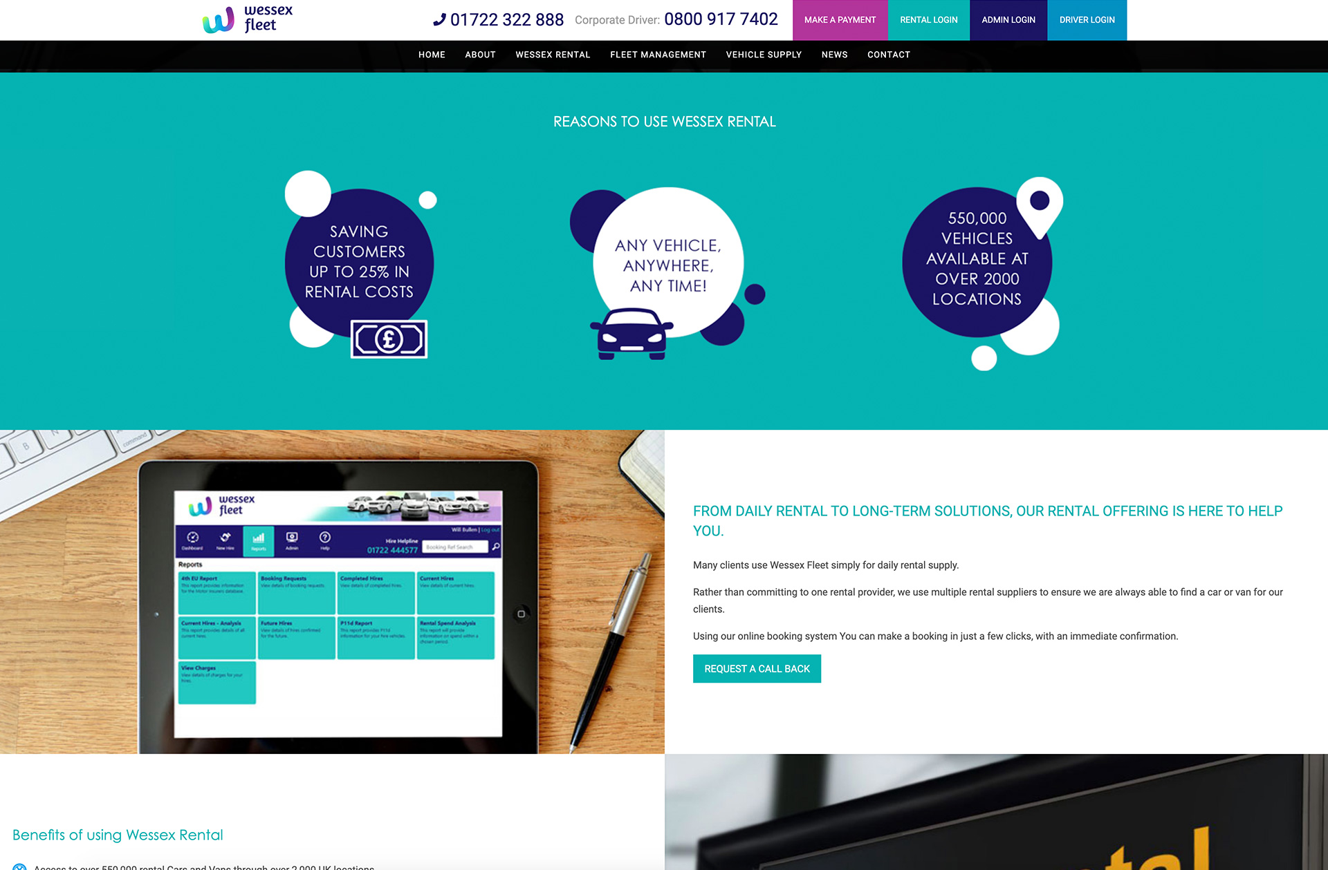
Due to us working hard in helping Wessex Fleet with their company re-brand, we knew exactly what kind of design their new website needed, and the colour palette that should be used.
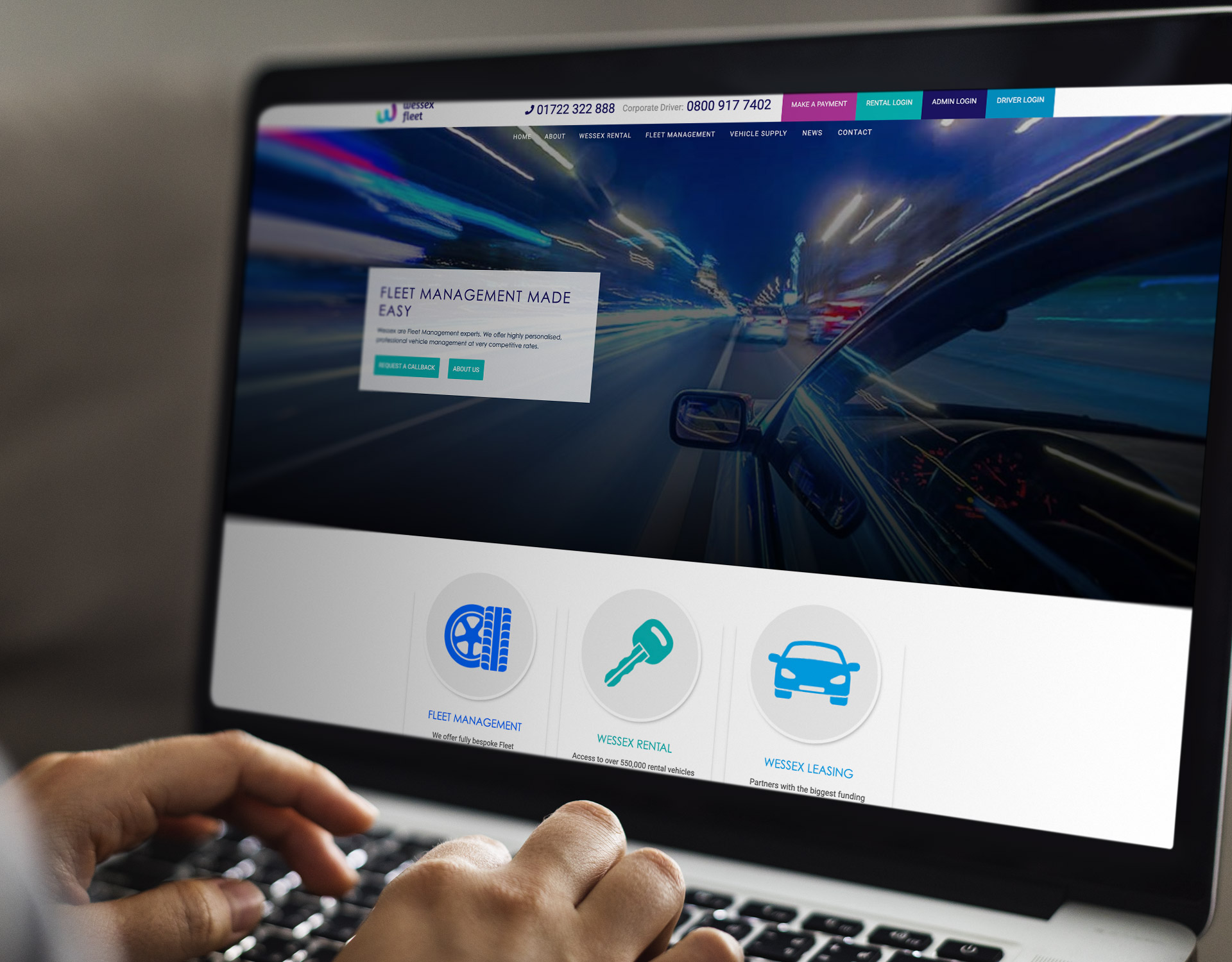
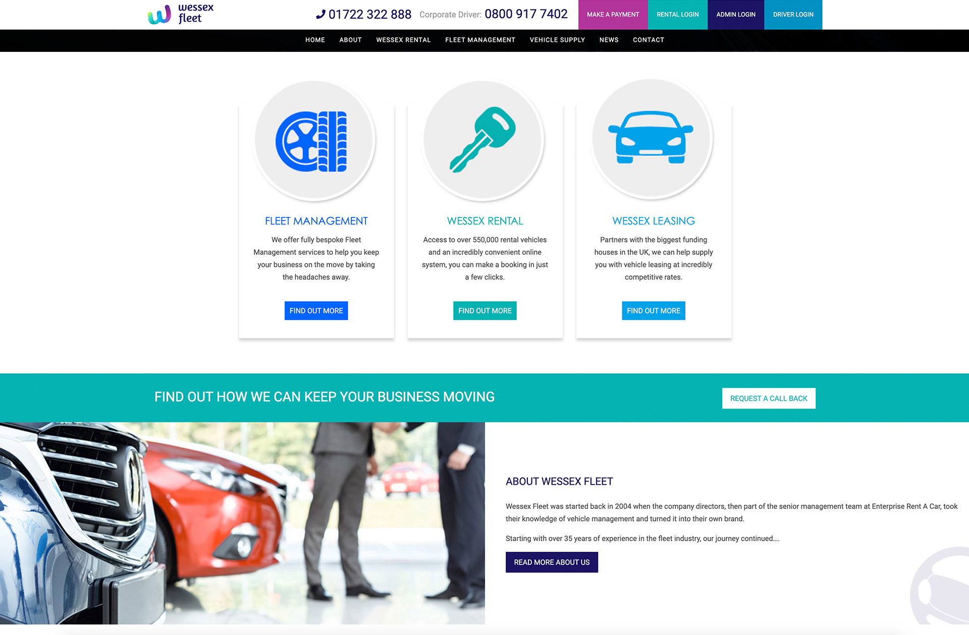
We had selected bold brand colours for the Wessex Fleet logo and these have been used throughout the new and modern design to draw attention to important elements of the website. Ultimately improving the customers journey through the site and helping indicate where they may need to go.
Wessex Fleet overview
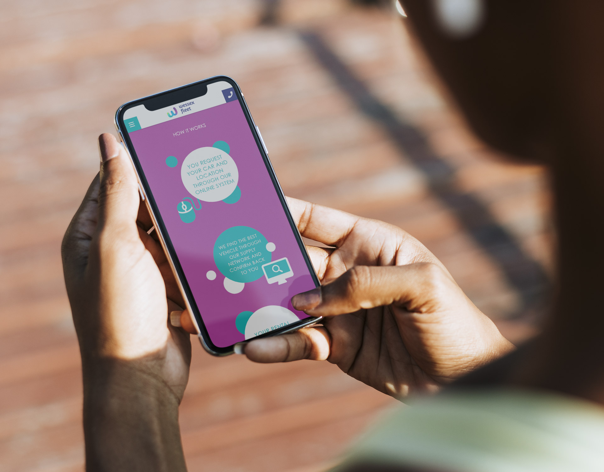
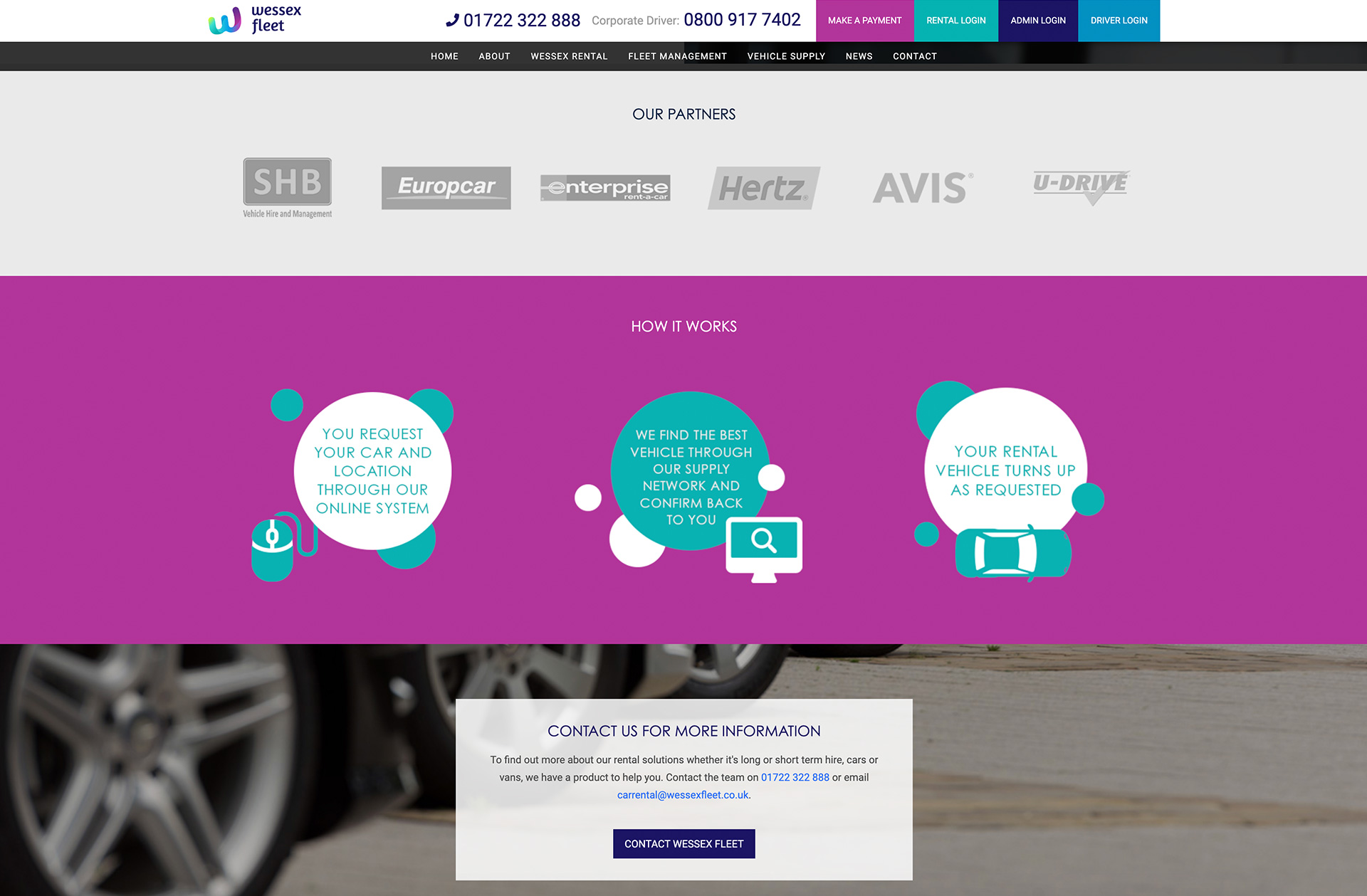
The use of bright colours include, but are not limited to, their call to action buttons, unique selling points, and the description of how the company works which is displayed in a neat diagram. This helps the important information stand out and draw the attention of the user.
What we delivered
Help customers find what they need
All websites should have a simple navigation bar that enables customers to find their way around with ease, and this is what we designed for the new Wessex Fleet site.
People can easily locate the most important landing pages, and can then work their way around from their depending on the service that they require. This means that they are far less likely to get frustrated and more likely to research their options further.
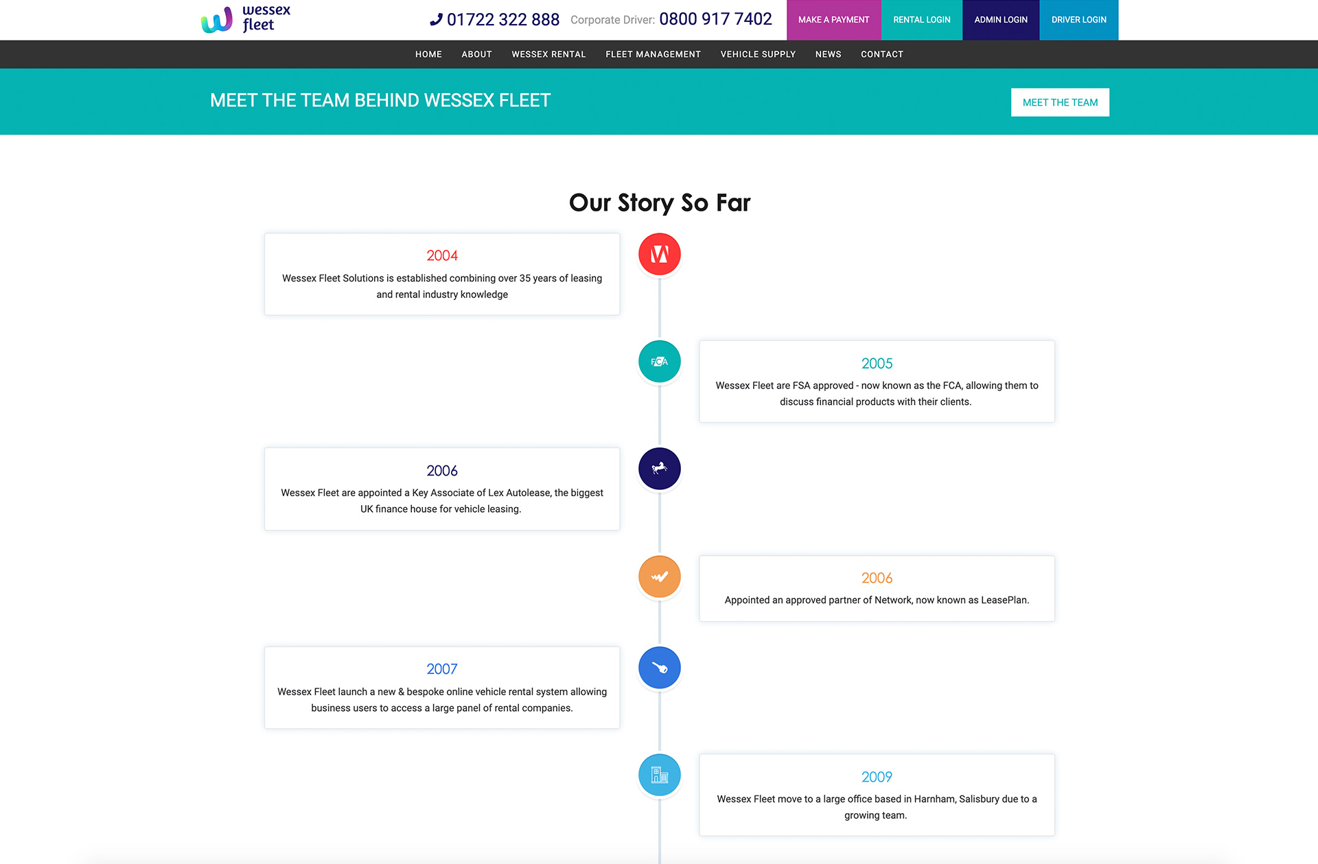
The simplicity of imagery
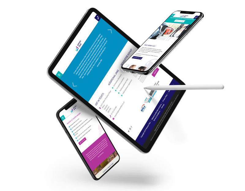
We decided on simple imagery for the Wessex Fleet website which helps to break up the text and add some subtle colour, but doesn’t draw focus away from the selling points and call to action options that the company want to promote. This way, potential customers won’t be overwhelmed by text and can read it in bite-sized chunks which is far more appealing to web users.
Spread the word!
Social proofing is very important when it comes to attracting new business, so we decided to display some great testimonials in a bold carousel which appears across the website. This gives Wessex Fleet the chance to share some of their best reviews, which really helps in gaining trust and building business with people. The bold colours that we used from the brand palette really stands out and will get the testimonials the attention that they deserve.
Promote your partners
Another vital piece of information that we need to include was Wessex Fleet’s partners. To keep the theme of the website consistent, we decided to keep the partners’ logos in subtle grey tones so that they are easy to read, but won’t clash with the bold colour palette that was chosen during Wessex Fleet’s rebranding.
Related Projects


Our accreditations