Steele Rose
You local and friendly, not for profit probate specialists
Steele Rose are a team of probate specialists and have developed a unique and never-before-seen digital probate machine that allows clients to work their way through the probate application process with ease.
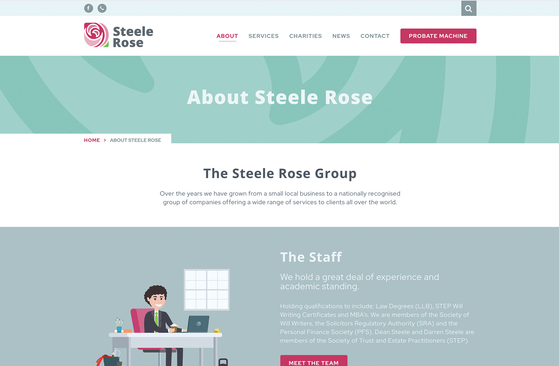
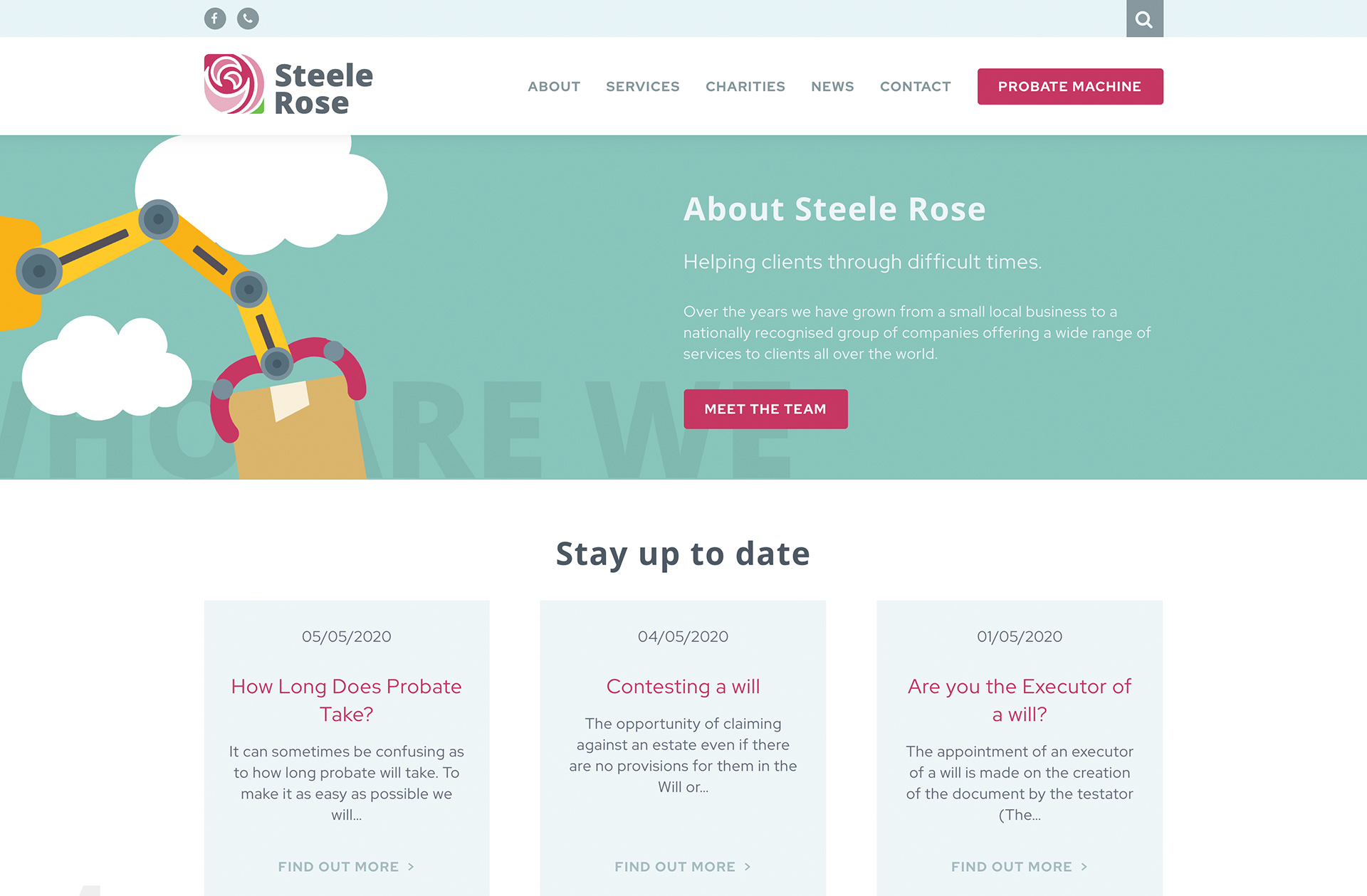
Starting as a small and local business, they have since grown into a nationally recognised group that understand the probate process can be complicated and hard to navigate – which is why they have made the process easier for you!
Steele Rose overview
Steele Rose came to us wanting to completely overhaul their company image. They were looking for a brand new logo with updated company stationery and new printed marketing materials. As well as this, they required a new website design that included their innovative new ‘Probate Machine’ functionality.
What we delivered
Brand new identity
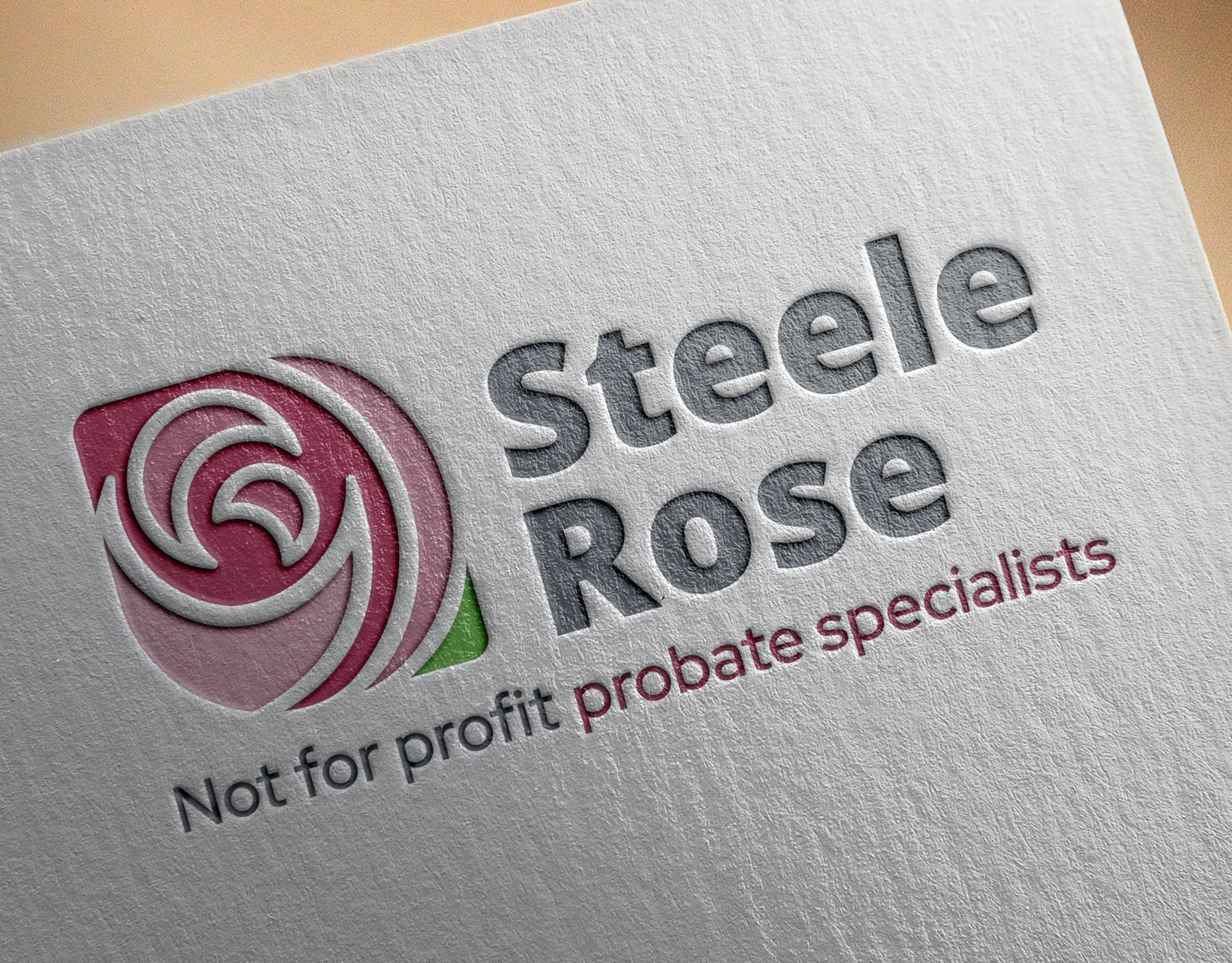
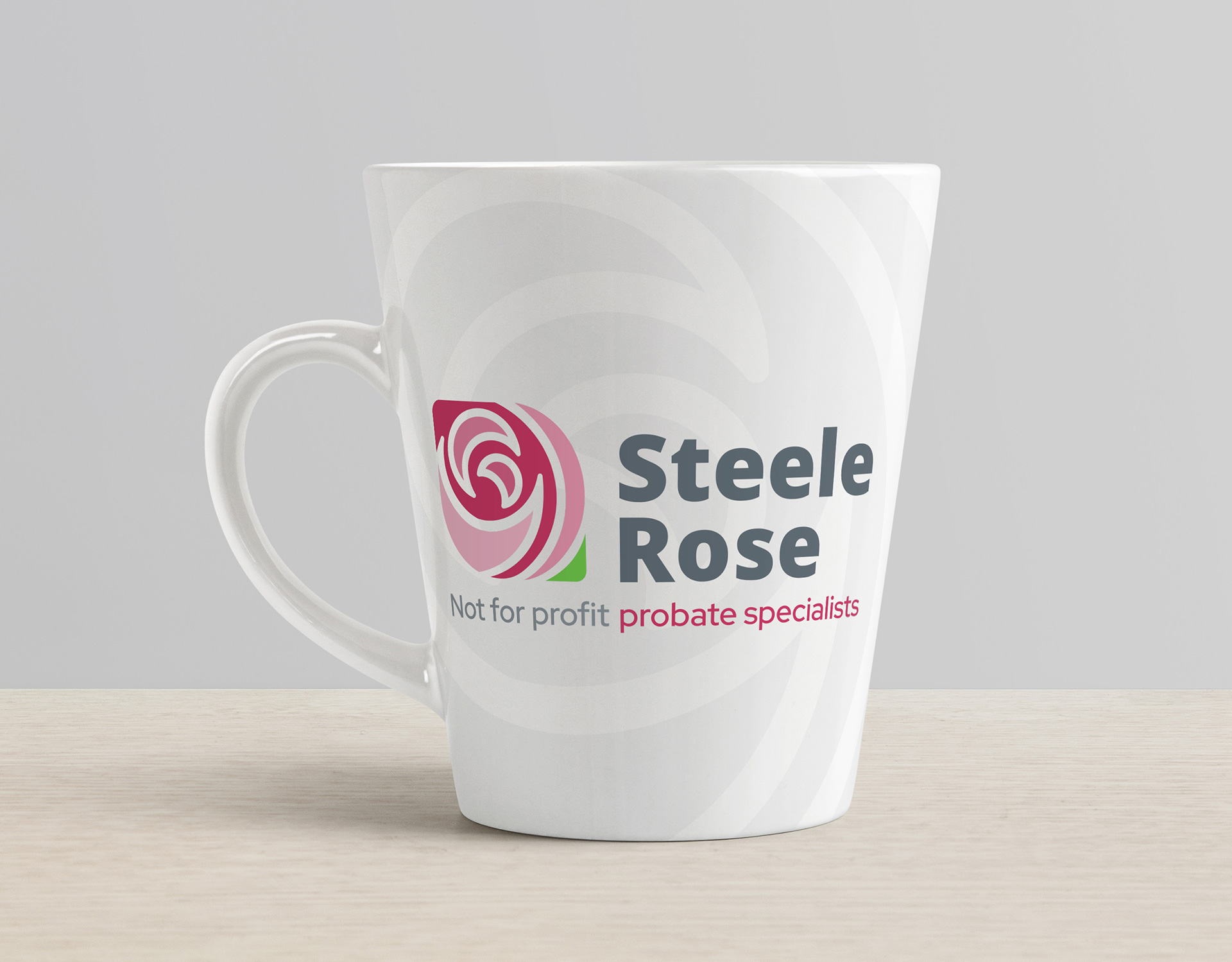
A unique brand identity paired with brand consistency is integral to having an instantly recognisable company, whilst still standing out from the crowd. We started this project by creating a new and unique logo for our client.
A common phrase we kept coming across with Steele Rose was wanting to be ‘quirkily different’, and after a lot of development, we landed on an abstract rose design. By using a striking colour palette and abstract shapes, we made sure the logo icon really stood out from the crowd and this design started our illustration journey.
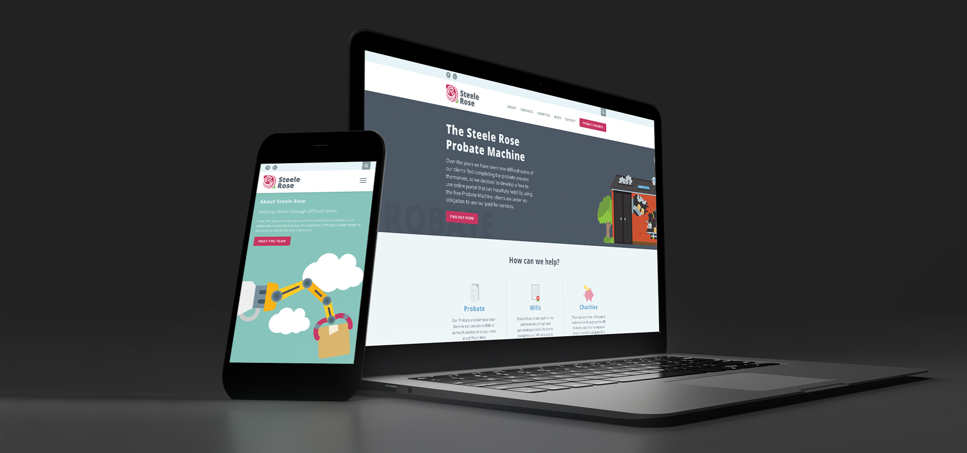
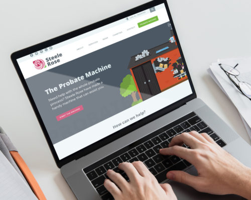
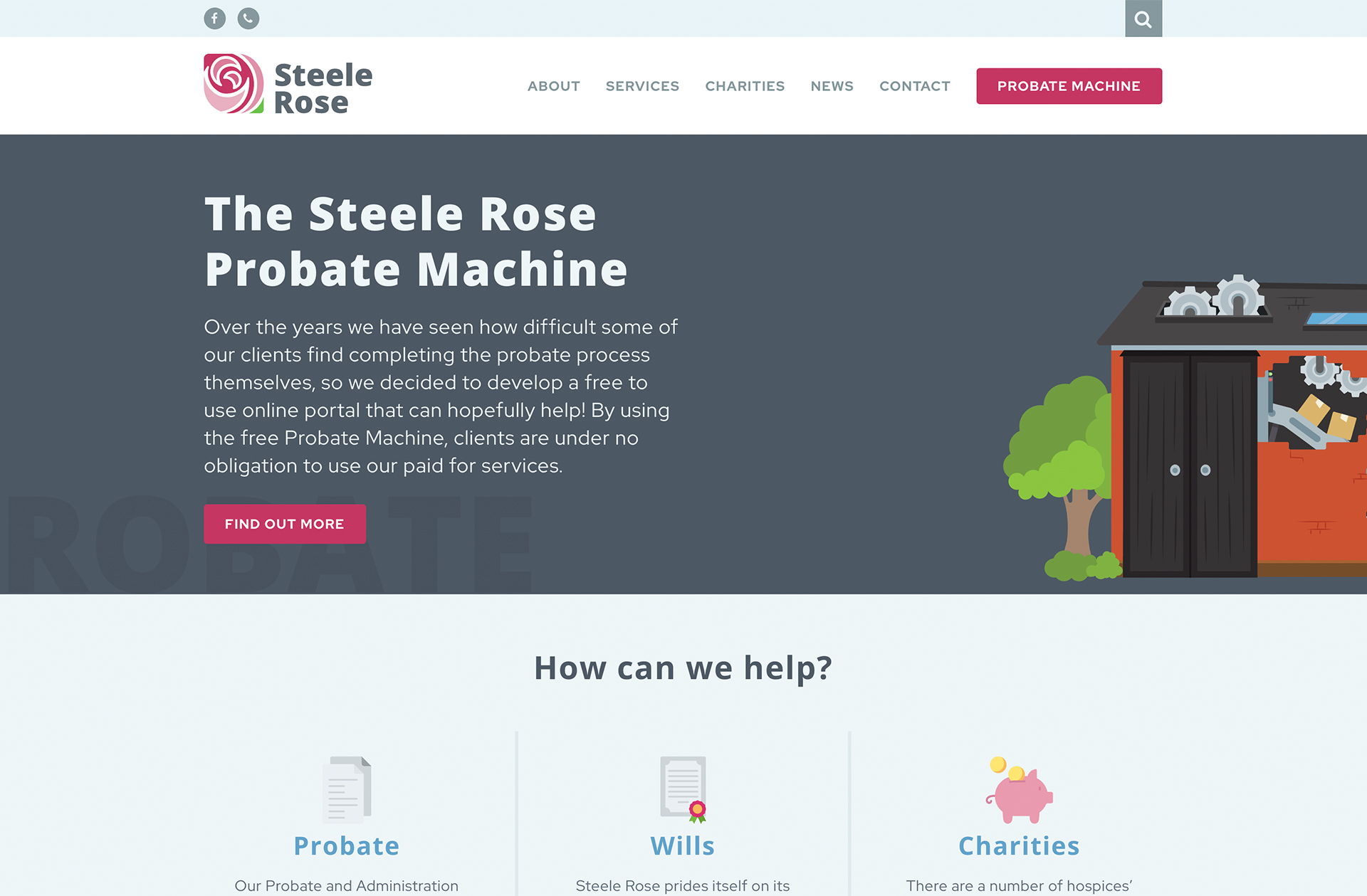
The probate machine
After finalising the logo and creating a cohesive brand guidelines document for the client, we moved on to beginning the print materials. We created simple yet striking stationery for Steele Rose, exploring the abstract shape style further at the header and footer of our designs, creating a style that would begin to be recognisable for the client.
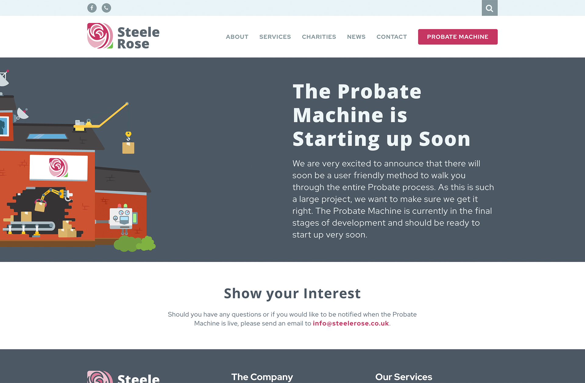
Next on the agenda was the unique and exciting Probate Machine illustration. Steele Rose wanted to visually illustrate how their new website system will work in a unique and quirky way, that would be distinctive to them and used throughout their marketing materials.
The idea was to show the Steele Rose office building as a working machine with different and fun elements to sell the product. Our in house illustration team hit the nail on the head the first time around and created an incredible and special graphic.
A tactile approach
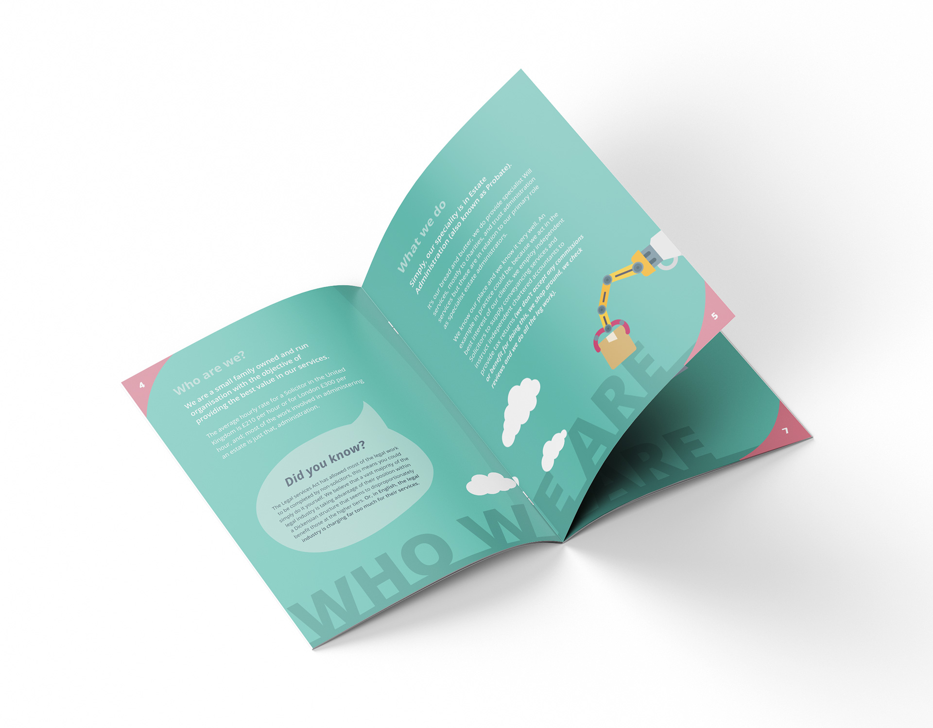
Steele Rose wanted an array of printed marketing materials to be able to send to prospective clients that clearly and simply explains who Steele Rose are, what Probate is and how Steele Rose can help. Together we designed a bold and eye-catching brochure that utilised the new probate machine throughout. The page spreads consisted of stand-alone elements of the machine, bright and bold colour schemes and large, prominent typefaces.
All of these elements together created a very unique and quirky brand image for Steele Rose, that we carried into the rest of the print work. We created a just as stimulating A4 folder to hold the brochure that included a custom journey illustration showing the timeline of the Steele Rose company, where they came from and where they are now.
Unique website functionality
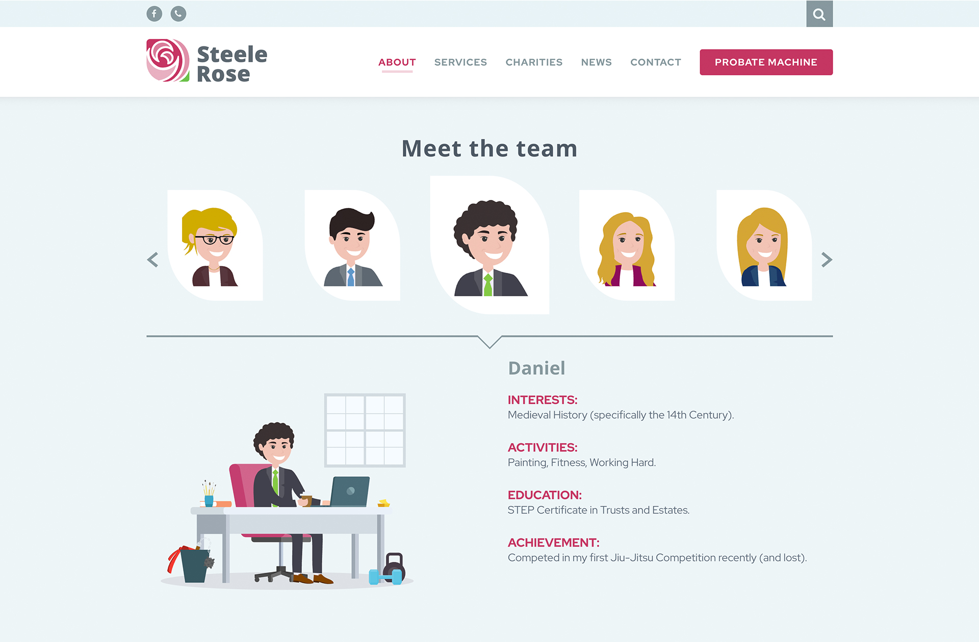
Once we had finalised a brand identity route for Steele Rose, the website design came naturally and followed the brochure style to create consistency across the board. We had the user experience (UX) in mind and designed the website to be easy to navigate and understand. The development was split into two phases; the first phase was to launch the new Steele Rose website design, making it fully responsive and mobile-friendly.
Phase two was the launch of the brand new probate machine side of the website. This unique system kept the user journey in the mind and it takes the stress away from the confusing probate application process. The system breaks it down into 5 easy stages, with sections of the form broken down easy to navigate individual tasks. This innovative idea was never before been seen for this market and we are proud to be part of the process.
Website gallery
Related Projects

Our accreditations